
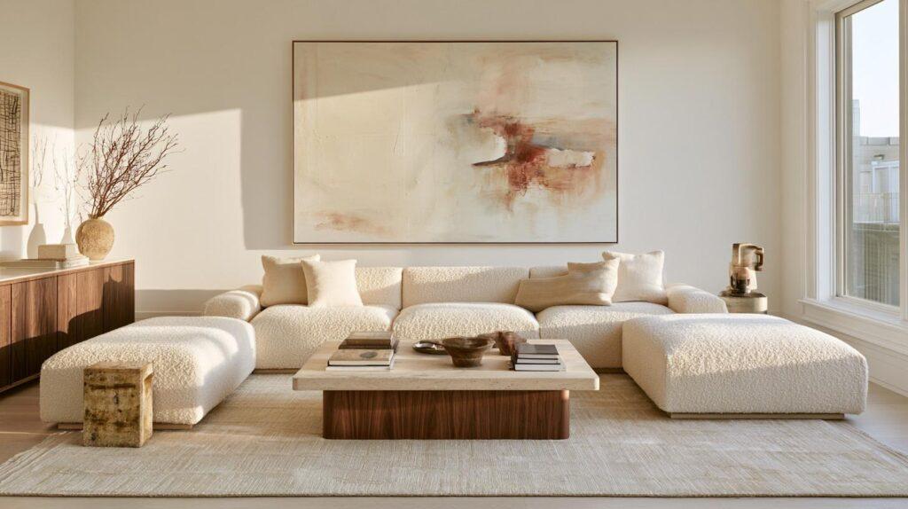
Get the Look: The Organic-Modern Furniture Behind Today’s Celebrity Homes
The rooms that photograph as calm, warm, and quietly expensive usually are not packed with furniture or decorative objects. Their impact comes from scale, material, and editing. Warm timber carries visual weight. Low furniture gives the eye room to travel. Linen, stone, matte finishes, and aged metal soften the harder edges of contemporary architecture.
That is organic modern in plain terms: clean contemporary shapes made warmer through natural materials, softer textures, and enough breathing room for individual pieces to register. Japandi, the meeting point between Japanese restraint and Scandinavian warmth, sometimes overlaps with the look, particularly where pale woods and uncluttered surfaces are concerned.
The useful lesson is not to copy a celebrity room piece for piece. It is to understand why the room works.
The First Piece Sets the Tone
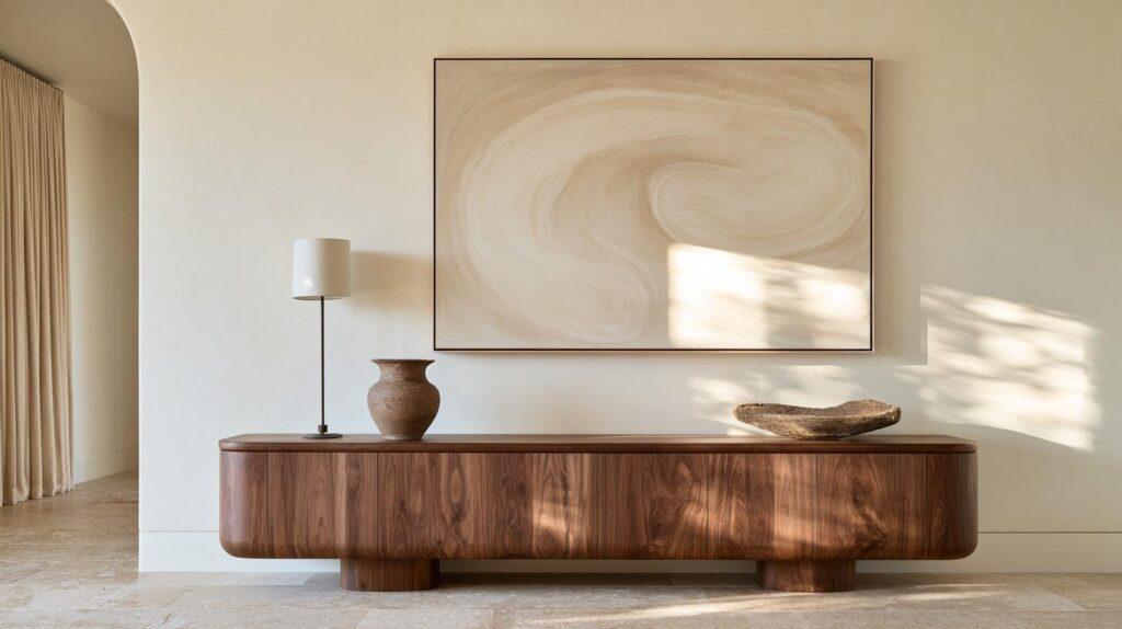
An entryway is where this becomes obvious.
The common mistake is filling the space too quickly. A narrow wall gets a small table, then a tray, candles, framed photos, books, and whatever else seems capable of making it feel finished. The result can look busy before the rest of the house has even started.
A better move is to establish one clear horizontal line.
As a practical starting point, a console that takes up around two-thirds of the usable wall often feels more intentional than something noticeably undersized. Treat that as a styling guide rather than a formula. A broad wall can swallow a narrow piece, while a tight hallway may need something shallower simply to keep circulation comfortable.
Material matters just as much as width. White oak keeps a pale room warm without introducing heavy contrast. Walnut has more visual gravity, especially against cream or warm white. Reclaimed wood brings irregular grain and texture. Honed stone creates a quieter, more architectural effect.
Then stop decorating sooner than instinct tells you to.
One lamp or tall vessel can establish height. Add a sculptural object or low bowl, while art or a mirror above handles the wall. The remaining surface does not need rescuing. Empty space is part of the composition.
A long, restrained piece in warm wood can do much of the visual work by itself, and the silhouettes in AURA Modern Home’s console table collection fit that organic-modern approach without making the entry feel like a showroom.
The expensive look tends to disappear when every object asks for attention at the same volume.
The Bedroom Works Because Nothing Is Fighting for Attention
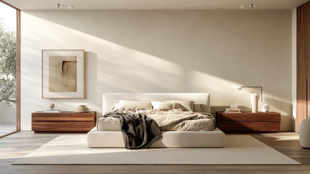
Bedrooms in polished home tours often sit lower to the ground than people expect. The bed frame is low. Nightstands are compact. Lamps have presence without towering over everything.
That horizontal emphasis gives windows, artwork, wall texture, and ceiling height more room to register.
Natural textiles soften the structure. Linen works because its texture rarely looks too perfect. Wool adds visual weight. Boucle can provide another layer, although using it on every chair, bench, and cushion quickly turns a material into a theme.
A neutral bedroom still needs contrast.
This is where the beige-room formula often fails. Beige walls, cream bedding, pale carpet, blond timber, and ivory upholstery can all be attractive on their own and still flatten each other when they carry similar visual weight.
Restrained is not the same as washed out.
A single darker note may be enough. Walnut nightstands can ground pale bedding, while a charcoal throw sharpens a creamy palette. Aged brass introduces warmth but still gives the eye something distinct to land on.
Perfect bedside symmetry is optional, too. Similar height and visual weight often matter more than having two identical nightstands topped with two identical lamps. Matching everything can make a room feel orderly. Push it too far and the room starts to feel staged.
The goal is calm, not obedience.
The Mirror Does More Than Reflect the Room
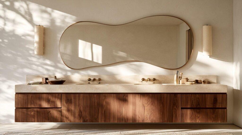
Bathrooms and dressing areas offer another useful lesson: the mirror can act as the sculpture.
An oversized rectangular mirror can make a vanity feel more architectural. A softly irregular shape can break up straight cabinetry and tile without adding another decorative layer. Warm metal frames work particularly well when the rest of the room leans toward pale stone and natural wood.
Scale is where people tend to get timid.
A small mirror floating above a substantial vanity can make the composition look unresolved. It does not need to match the vanity width exactly, but it should be large enough that the two pieces read as one arrangement instead of unrelated objects sharing a wall.
The vanity itself can soften the room, too. Visible legs, pronounced wood grain, or a furniture-like silhouette bring some of the warmth of a bedroom piece into a space otherwise dominated by hard surfaces.
Travertine and limestone tones sit comfortably beside warm timber because both introduce natural variation without requiring sharp color contrast. Dark walnut can do the opposite job, giving a pale room a strong visual anchor.
Curves need editing, though.
A rounded mirror beside a simple vanity can feel elegant. Add an arched shelf, globe sconces, a pebble-shaped stool, and a wavy vase in the same sight line, and the idea starts explaining itself too loudly.
One organic shape often has more authority than five.
What the Expensive Rooms Leave Out
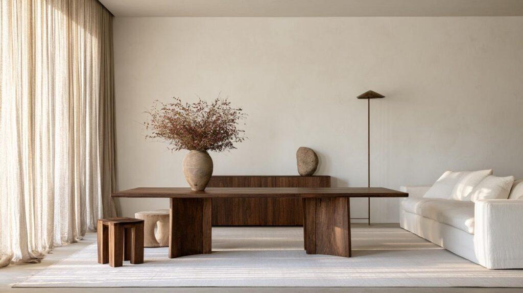
The easiest way to misunderstand quiet luxury is to think the answer is simply owning less.
It is not.
The more useful principle is to give fewer objects more responsibility. Before adding something new, work out what the room actually lacks.
Sometimes the missing element is height, and a tall lamp solves it without requiring a collection of smaller accessories. A pale room may need the warmth of walnut or aged metal instead. Linen curtains can soften architecture that feels too hard, while a dark frame or stone object may provide just enough contrast to keep a neutral scheme from disappearing into itself.
Natural materials require discipline as well. Different woods can coexist beautifully, but several unrelated timber tones in one sight line can feel accidental. Choose a dominant wood family, then introduce another tone deliberately rather than trying to match every grain exactly.
Real life complicates the picture, and this is where glossy inspiration can become unhelpful. A household with children, pets, limited storage, or a small footprint cannot keep every surface bare. Nor should it.
Restraint only works if the room still works.
Concealed storage may matter more than maintaining a perfectly empty surface. Washable textiles can be a better choice than precious upholstery. A durable finish that develops character with use may feel more luxurious in practice than one that needs constant protection.
The most useful lesson from celebrity interiors is not the celebrity part at all. Bigger budgets make sourcing easier, but they also create more opportunities to overfill a room.
The harder skill is editing.
Get one substantial decision right. Give it enough space to matter. Then resist the urge to rescue every remaining inch.
That is usually where the room starts to look expensive.