
Two-Column Resume or One? What Gets You Past the ATS in 2026
You’ve probably heard the warning: never use a two-column resume, or the applicant tracking system (ATS) will shred it before a human even sees your name. It’s one of the most repeated pieces of job-search advice out there, and it’s mostly wrong.
The real story is more useful, and a lot less scary. Modern ATS platforms read columns just fine. What actually sinks a resume has more to do with factors like missing keywords, text structure, and a handful of formatting habits that have nothing to do with how many columns you use.
Here’s what the layout question really comes down to, and how to make the call with confidence.
The prevailing myth that double-column resumes equal failure
Somewhere along the way, “two columns” became shorthand for “risky.” Career blogs repeat it, LinkedIn posts repeat it, and plenty of job seekers have quietly ditched a layout they liked because of a rule that’s years out of date.
The myth survives because it has a kernel of truth buried in it. A small number of older, legacy systems, often used by government agencies or large enterprise HR departments, do read strictly top to bottom and can scramble a multi-column layout. But that’s a narrow exception, not the rule. For the vast majority of companies hiring in 2026, column count is an editorial choice, not a technical gamble.
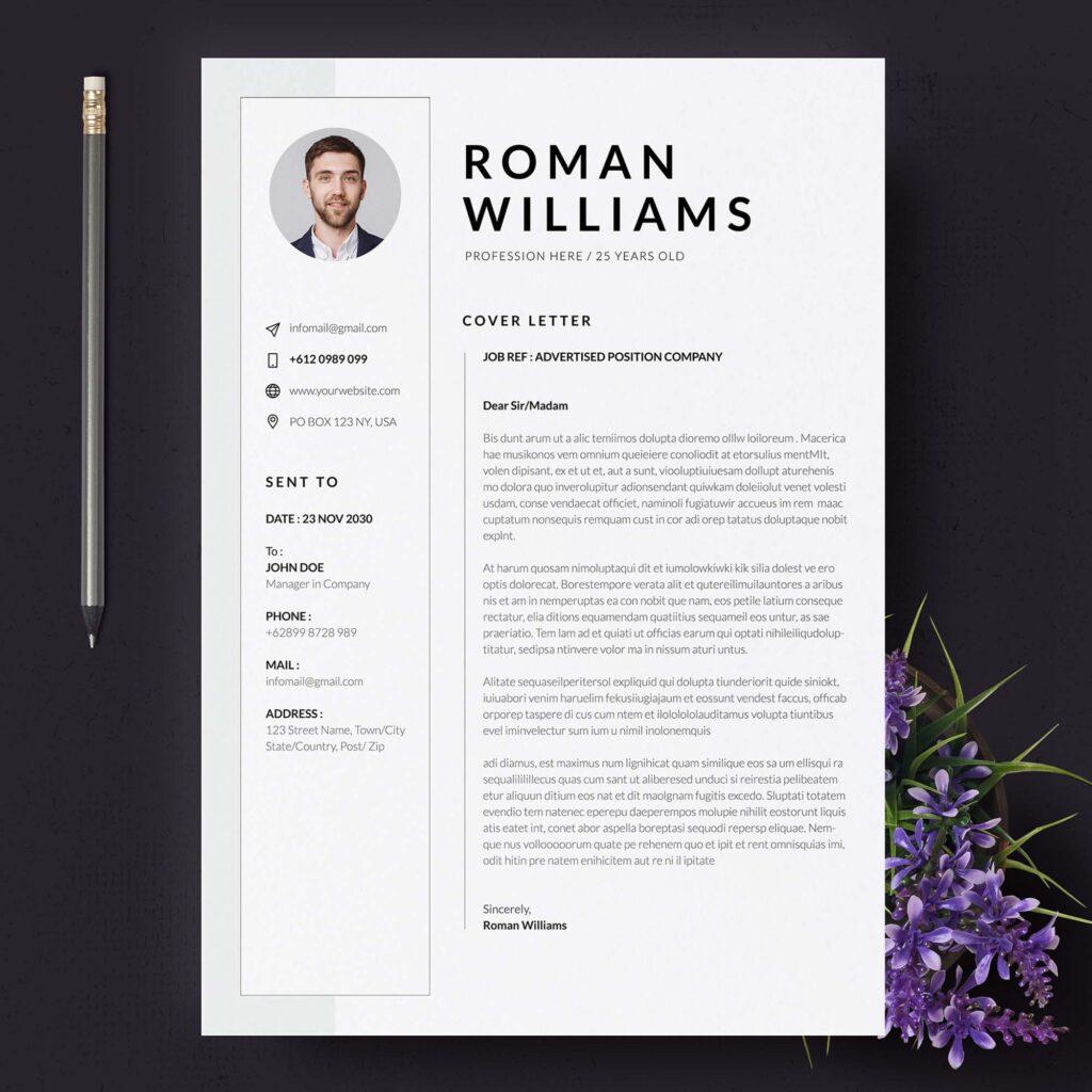
Why the two-column resume is so appealing
A second column lets you fit a skills list, certifications, or contact details alongside your experience without pushing everything onto a second page. For someone with 15 years of experience trying to stay on one page, that’s real estate you can’t afford to waste.
It also just looks more finished. A single dense column of text, stacked bullet after bullet, can feel like a wall. A second column breaks that up, gives the eye somewhere to land, and signals that you thought about the reader’s experience, not only your own resume history.
For career-changers and people in visual fields, there’s a design case too: a smart column layout can carry information hierarchy that a single column can’t.
What does an ATS do with your layout?
An ATS doesn’t “read” a resume the way a person does. It parses the file, breaking the text into fields (name, dates, job titles, skills) so a recruiter can search and sort applicants later. That process depends on the file having real, selectable text, not on the number of columns.
Modern systems, including the parsers behind platforms like Workday, Greenhouse, and Lever, are built to recognize section headings (“Experience,” “Education,” “Skills”) and reconstruct reading order even across a split layout.
What actually breaks parsing has nothing to do with columns. It could be a resume saved as a flattened image instead of text, contact information buried inside a header or footer some older systems skip, or a decorative table used as the page’s structural skeleton instead of clean text flow.
In fact, research on how ATS platforms behave in the wild backs this up. In a 2025 survey of 25 U.S. recruiters, 92% said their systems don’t auto-reject resumes for formatting or design at all. The software sorts and organizes; a person still makes the call.
So, single-column or two-column?
Once you know both layouts parse fine, the decision stops being about safety and becomes about strategy. It comes down to how much you’re trying to fit on the page, and what your industry expects to see.
Resume length is part of that math. If you’re early-career with one page to fill, a single column often reads cleaner: there’s less content competing for the reader’s attention, so a straightforward top-to-bottom flow does the job.
If you’ve got 10, 15, or 20 years behind you, a second column becomes a genuine space-saver rather than a design flourish.
Industry norms matter just as much:
- Single column tends to be the safer default in traditional, conservative fields: law, academia, government, finance at more established firms. These industries expect a document that reads like a formal record, not a designed artifact.
- Double column gives you more flexibility, and it shows up often in tech, engineering, and senior or executive-level resumes, where candidates need to fit a broad skill set, multiple certifications, or a longer track record without sprawling to page three.
Neither choice is inherently more “ATS-safe.” The choice is about audience, not algorithm.
The best resume builders for ATS-safe templates
If you’d rather not troubleshoot column structure by hand, the right builder handles it for you. Here’s how the major players stack up.
Enhancv
Every Enhancv resume template is tested with leading ATS vendors, including Sovren and RChilli, to confirm accurate parsing before it ever reaches a recruiter’s inbox. Section headings match the exact language parsers are trained to recognize, columns stay isolated by section so reading order never breaks, and every export ships as a real PDF with a full text layer rather than a flattened image.
On top of the job-tailoring tool and the resume checker, Enhancv lets you compare how your resume reads to a recruiter side by side with how it reads to an ATS, so you can see both versions before you hit send.
That side-by-side view is the reassurance most builders skip. You’re not guessing whether a clean layout survives the parser, you can see it. Which is exactly the kind of proof that’s earned Enhancv its reputation as the best resume builder for anyone who needs a document that’s confidently parsable and genuinely worth reading.
MyPerfectResume
MyPerfectResume sticks to a set of classic templates guided by a step-by-step wizard, which keeps the layout predictable and easy to parse by design. The tradeoff is flexibility: its ATS check grades your resume against broad industry standards rather than a specific job posting, so you get a general read on parsability, not a tailored one. For a straightforward single-column resume, that’s a reasonable safety net. For a two-column layout built around a given role, it offers less room to fine-tune the fit.
ResumeGenius
ResumeGenius keeps its template library intentionally conservative, which works in its favor for parsability: simple, single-column-leaning layouts with clear section breaks tend to sail through most systems without a second thought. If you want a safe, traditional-looking resume with minimal formatting risk, it’s a solid pick.
Resume.io
Resume.io locks the layout inside each template, so you’re filling in fields rather than adjusting the structure, which cuts down on the kind of formatting mistakes that can trip up a parser. Its ATS check gives you a concrete match-score percentage against a pasted job description, a nice, specific number to work from. One thing worth knowing: its free tier only exports as a plain TXT file, which strips out any layout entirely. It’s technically about as parsable as text gets, but it’s not a document you’d really send to a recruiter.
A quick ATS-safe checklist (regardless of tool)
Whatever builder you use, and whichever layout you land on, a few checks apply across the board:
- Match the keywords in the job posting, not just the job title. Parsers search for exact terms, so if the posting says ‘project management,’ write that instead of a close synonym.
- Export as a PDF with selectable, real text, never a scanned or flattened image.
- Keep each section’s content inside its own column; never split one section across both sides.
- Use standard section headers (“Experience,” “Education,” “Skills”) instead of icons or stylized substitutes.
- Skip tables and text boxes as layout scaffolding.
- Keep contact information in the main body of the page, not buried in a header or footer.
- Stick to clean, readable fonts, and avoid embedding critical information inside graphics.
None of these have anything to do with how many columns your resume has. They’re just good habits for any layout.
The bottom line
The two-column resume was never the problem. Modern ATS platforms handle multi-column layouts without issue, and the real risks sit somewhere else entirely: flattened PDFs, buried contact details, and sections that split across the page in ways no parser can follow, and resumes with the right layout but the wrong words.
Pick your layout based on your industry, your experience level, and how much you need to fit on the page, not out of fear of a filter that mostly isn’t watching for it. Build it cleanly, keep the language matched to the posting, and a two-column resume can carry just as much weight with an ATS as a single column ever could, while giving your human reader a document that’s actually a pleasure to scan.