Choosing Exterior Colours for a Melbourne Bayside Home
A pale exterior can look warm and inviting on one house and unexpectedly cold on the next. The paint name may be identical. What changes is everything around it: the roof, paving, window frames, surrounding greenery and the light falling across the facade.
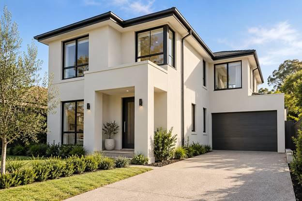
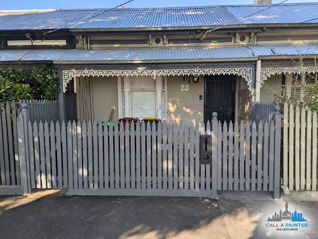
For a home in Melbourne’s Bayside suburbs, including Brighton, the architecture provides a useful starting point. A period frontage and a contemporary rendered house can need quite different palettes, even on the same street. Start with the features that will stay. Then test how a small group of possible colours behaves beside them. This approach is more useful than searching for a single shade described as perfect for every coastal property.
Make a list of the colours already present
Before opening a paint chart, walk around the house and record the fixed finishes. These could include terracotta roof tiles, dark metal windows, warm brickwork, pale stone, a concrete driveway or stained timber. Even a modest house may already contain several strong colour relationships.
Some of those finishes will dominate the street view. Others matter most at the entrance or in the garden. Take photographs from those different positions and note which materials appear together. The main wall colour needs to make sense in more than one carefully framed photograph.
If a roof replacement or new fence is genuinely planned, include the confirmed finish in the decision. If it is only a future possibility, design around the building as it exists. Choosing today’s paint around an undecided renovation can leave the house feeling unresolved for years.
Decide what the house should emphasise
An exterior palette directs attention. A contrasting door invites the eye towards the entrance. Darker window frames can define openings. A fence that competes strongly with the facade may become the first thing people notice, whether that was intended or not.
Choose a clear priority before comparing individual shades. On a detailed period home, the architecture may provide enough interest with relatively quiet colour differences. On a simpler facade, the entry could carry a more distinct accent. Neither approach requires every component to be the same colour.
Draw a small schedule with a line for walls, trims, door and fence. Write the proposed colour beside each one. If the list contains many unrelated colours, simplify it and compare the result. This is an inexpensive way to clarify a scheme before purchasing test pots.
Look at undertones beside the real materials
Whites, greys and neutral shades are not interchangeable. A sample that appears almost colourless on its own can reveal a warm, greenish or cooler character beside brick or stone. The neighbouring material provides a comparison that a small isolated swatch cannot.
Put the sample directly beside a window frame, roof reference or section of masonry that will remain. Consider the relationship rather than deciding whether the paint is attractive by itself. If one sample makes a fixed finish feel awkward, try another before assuming that the fixed finish must change.
Use an actual painted sample large enough to judge from a few steps away. A phone photograph can help record options, but the screen should not make the final decision. Camera exposure, display settings and reflected surroundings can change how a colour appears in the image.
Test the parts of the house with different light
One wall may be open to the sky while another sits beneath a verandah. An entrance may receive borrowed light from pale paving. A boundary wall or established tree can influence the view in a way that is absent from an online inspiration photograph.
Move sample boards around these positions and look at them at several times of day. Include a bright period and a shaded one when possible. Leave yourself enough time to notice whether a shade you liked initially becomes too stark or too subdued in the setting you use most.
Dulux’s exterior colour guidance is a helpful reference when organising the palette. The final choice still belongs on the actual building, where its roof, landscaping and light can be considered together.
Check the entrance at human scale
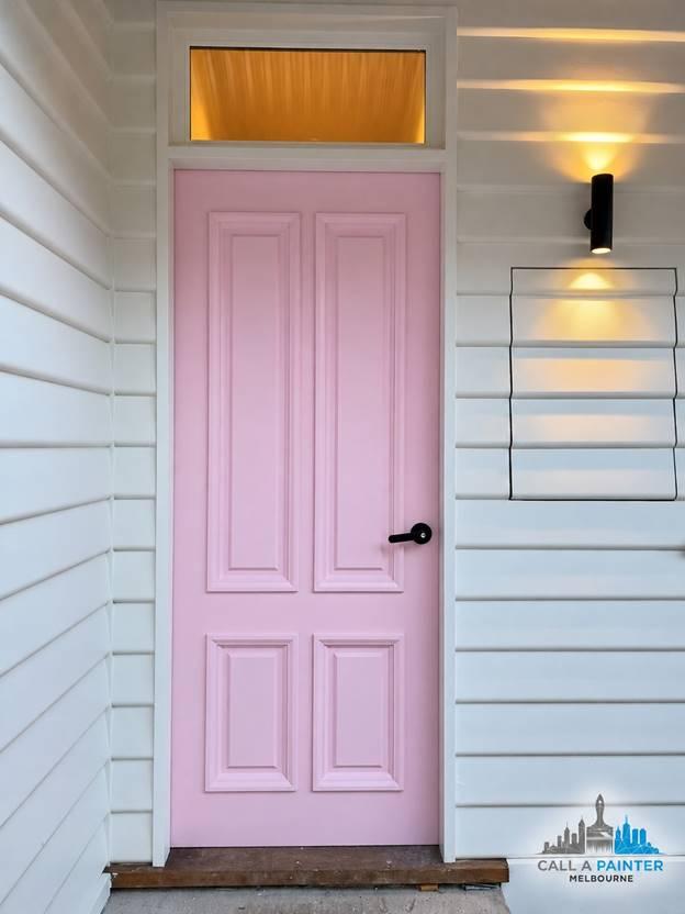
The street view matters, but visitors experience the door from a much shorter distance. Look at the proposed door colour with its hardware, wall lights, threshold and surrounding trim. A small difference that disappears from the footpath may be quite noticeable when someone reaches for the handle.
The door can carry personality without requiring a dramatic change to every wall. Try the accent alongside the intended trim before committing to either. If the trim is being retained, use that existing finish as the reference rather than assuming a generic white will match it.
Consider the inside view too. An open door may be visible from a hall with a different palette. Decide which faces and edges are included in the repaint and document those details. They are easy to overlook while discussing the exterior photograph.
Separate the colour decision from the coating specification
Choosing a colour does not complete the technical specification. Timber, painted masonry and metal can require different systems. Existing coatings and surface condition also affect preparation. Ask the painter to nominate suitable products and explain any limitations before the colours are signed off.
This matters when considering a substantial move from a pale finish to a very dark one. Check suitability with the relevant coating and substrate manufacturers, particularly for components with their own finish requirements. An attractive sample is only one part of the decision.
Owners reviewing Call A Painter Melbourne’s exterior painting service can use the consultation to connect those choices: what should the house look like, which materials are involved and what preparation does each area need? Bringing a short list of samples makes that discussion more focused.
Choose a scheme you can maintain
Ask yourself which details will be straightforward to refresh later. An unusual finish across several separate materials may require more careful record-keeping than a simple wall and trim arrangement. Keep a written schedule of product, colour, sheen and application area for every part of the project.
Discuss the exposed and sheltered elevations individually. Bayside is a broad description, and two nearby properties can have different site conditions. The actual building deserves an inspection rather than a standard coating prescription based only on its suburb.
When comparing painting services in Brighton, include the inspection, sample process and written scope in the conversation. Those details help translate a visual idea into work that can be priced and carried out consistently.
A satisfying exterior scheme usually feels connected to the home rather than imposed on it. The roof still belongs, the entrance is easy to recognise and the different elevations make sense together. Testing fewer colours carefully is often a better path to that result than collecting an ever longer list of fashionable names.