Bringing Reports to Life with Power BI Custom Visuals
This piece will inspire your next report with creative Power BI dashboards. You’ll discover everything from waterfall charts for financial analysis (which you can learn more about at Zebra BI) to interactive slicers that help discover the full potential of your Power BI reports. Ready to make your data shine?
Custom visuals might seem daunting, but tools exist to make it possible without extensive coding knowledge. DENEB and Vega-Lite offer flexibility, while AppSource lets you share your creations.
Note that great dashboards tell stories. They guide viewers through data trips and highlight what matters most. Your reports should answer questions before anyone asks them.
Enhancing Interactivity with Custom Visuals
Static reports become exploration tools with interactive elements. Power BI gives you several ways to add interactivity that helps users participate and find insights at their own pace.
Use Slicers And Filters For User Control
Slicers work as visual filters right on your report page. Users can narrow down data without dealing with complex filter panes. Unlike hidden filters, slicers give users visible control over what they see.
Power BI comes with four main slicer types:
- Standard slicers – Vertical lists, tiles, or dropdowns for general filtering
- Button slicers – Customizable buttons with grid layouts and image support
- List slicers – Vertical lists with hierarchies and search functionality
- Text slicers – Free-form text input for custom filter criteria
The best part happens when you sync slicers across report pages. Users get frustrated when they need to pick the same filters on different pages.
Here’s how to fix this:
- Go to the View tab and select the Sync Slicers pane
- Select the slicer you want to share
- Check the pages where you want it to appear
This simple change makes your reports feel polished and professional. Well-formatted slicers improve functionality and make dashboards look cleaner. You can match colors, fonts, and styles with your report theme.
Add Tooltips For Contextual Insights
Basic tooltips show field names and values when users hover over data points. This helps, but often isn’t enough. Report page tooltips display entire mini-reports when users hover over visuals.
A sales manager can hover over this month’s revenue bar and see a breakdown by region and product category with charts and KPIs instantly. No clicks needed! Your main dashboard stays clean while hiding an extra layer of insights.
Creating custom tooltips is simple:
- Add a new report page
- Format the page as a tooltip (under Page Information)
- Design your mini-report with relevant visuals
- Set which fields should trigger this tooltip
Power BI also offers visual tooltips with built-in drill-down and drill-through actions. Users see an Actions footer when hovering over data points and can explore deeper without right-click menus.
Use Play Axis For Time-Based Exploration
The Play Axis custom visual adds movie-like animation to reports. It cycles through values automatically instead of manual clicking, bringing data to life.
Sales bubbles grow and shrink across a map as months progress. Product categories show their contribution to revenue each quarter. This storytelling approach makes patterns obvious.
Play Axis works best in specific cases:
- Visualizing time-series data (monthly sales, quarterly profits)
- Tracking geographic changes (customer expansion across regions)
- Comparing performance across categories (different salespeople or products)
- Analyzing stages in marketing funnels
You can enhance report playback with features like looping for live dashboard displays, auto-start when a report opens, and adjustable speed controls. When paired with Play Axis animations, Zebra BI waterfall charts become even more dynamic, helping teams visualize changes over time in a clear, engaging way that brings data to life.
Note that interactive elements should answer specific business questions or highlight important data relationships. These features help viewers become active explorers when used correctly.
Creative Use Cases for Power BI Dashboards
Power BI dashboards work best when applied to actual business challenges. Let’s get into specific scenarios where these visualizations add exceptional value to organizations of all sizes.
Sales And Revenue Tracking
Power BI stands out at visualizing sales performance through multiple dimensions. The VanArsdel sample dashboard shows how companies track their industry position among internal metrics. This dashboard combines key KPIs like market share (32.86%), sales volume (16,000), and sentiment scores (68). Sales leaders get a detailed view from these numbers.
The magic happens as we analyze sales changes over time. Charts showing “% Units Market Share vs. % Units Market Share Rolling 12 Months” emphasize major drops. Teams can respond quickly to market shifts. Sales leaders spot threats from competitors easily.
The dashboard points out major rivals like Aliqui through visualizations such as “Total Units YTD Variance %”.
To create a detailed sales analysis, you’ll need:
- Revenue comparison dashboards showing actual vs. target figures
- Sales performance visualizations showing top performers
- Product comparison charts showing winners and losers
- Pipeline tracking with conversion metrics at each stage
A well-laid-out sales dashboard shows which regions, products, and salespeople get results. As one expert notes, “This dashboard helps to identify top sales contributors and analyze how efficiently the company meets sales targets”.
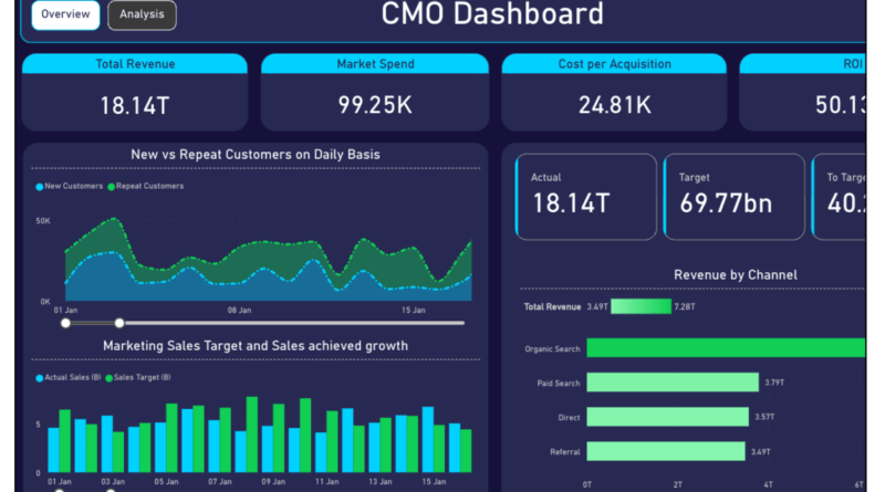
Marketing Performance Dashboards
Marketing teams face a tough challenge: data spread across many platforms. Power BI fixes this by pulling information from Google Ads, Facebook, email platforms, CRMs, and analytics tools into single dashboard.
These dashboards revolutionize marketing decisions by showing connections between channels. You see how campaigns work together and support overall goals. CMO dashboards typically show marketing spend versus revenue trends, ROI metrics, and how each channel contributes to the pipeline.
A smart approach links pre-revenue activities with results. This method predicts upcoming sales by looking at bottlenecks in lead conversion. By looking at open rates, click rates, and purchase data together, marketers learn which campaigns drive buying behavior.
Marketing performance dashboards calculate key metrics like customer acquisition cost (CAC) and customer lifetime value (CLV). These numbers show how well campaigns perform. The visualizations help teams quickly adjust underperforming channels by revealing which tactics convert best.
Geographic And Demographic Analysis
Location affects business decisions by a lot. Power BI’s ArcGIS integration adds location intelligence that turns regular data into strategic insight.
Picture overlaying sales figures against demographic data. The visualization might show that stores in areas with higher average household income (shown in dark blue on demographic layers) do better than others. This knowledge helps pick future store locations, products, and marketing approaches.
ArcGIS for Power BI offers valuable demographic data including:
- Average household income and size
- Diversity index (measuring racial and ethnic diversity)
- Median age, disposable income, and home values
- Population density and growth projections
These demographic insights lead to smarter targeting. Adding a “2020 Median Disposable Income” layer shows where people have extra money to spend on your products. You spot ideal customer locations visually instead of digging through complex spreadsheets.
The best geographic dashboards layer multiple data types. Start with sales by location, add demographic information, then include feature information panes and cards with detailed regional facts.
These elements create a complete picture that guides decisions about store placement, advertising focus, and product development. Check Zebra BI to learn more visualization techniques that enhance these geographic insights.
Building Your Own Custom Visuals
You might discover that the perfect visual for your data story doesn’t exist yet. This situation calls for building your own custom Power BI visuals.
Basics of Power BI Custom Visuals Development
Custom visuals are packages containing code that render your data.
Here’s what you need to start:
- Node.js and npm installed
- Power BI Visuals SDK (install via npm install -g powerbi-visuals-tools)
- A development IDE like Visual Studio Code
- Simple understanding of TypeScript (helpful but not mandatory)
The CLI tool creates a support structure that establishes your project’s framework. Your .pbiviz package will contain the code and metadata your visual needs to function.
Use Vega-Lite with DENEB For Flexibility
DENEB provides an innovative approach for those who don’t want to code from scratch. This certified custom visual helps you create advanced visualizations with Vega or Vega-Lite languages right inside Power BI.
DENEB stands out because it doesn’t need external dependencies. Your visuals work everywhere, including Report Server, mobile apps, and publish-to-web scenarios. The tool combines smoothly with Power BI’s interactivity features like tooltips and cross-filtering.
Test And Deploy Visuals In AppSource
Your visual needs these components to package:
- A .pbiviz file with complete metadata
- Sample .pbix report showcasing usage
- Logo (300×300px PNG)
- Screenshots (exactly 1366×768px)
AppSource submission requires privacy documentation and support URLs. Microsoft certifies visuals that meet specific code requirements, allowing them to appear in emails or export to PDF.
Conclusion
The right visuals for your specific data needs improve comprehension dramatically. Bar charts excel at comparisons, line charts show trends, and waterfall charts illustrate financial flows brilliantly. Zebra BI provides excellent waterfall chart options you should check out for your financial reporting needs.
Interactive elements elevate dashboards. Slicers, tooltips, and play axis features transform passive viewers into active participants. Users can explore data themselves and uncover insights you might have missed.
These techniques work magic when applied to specific business challenges. Power BI handles everything beautifully – from tracking sales performance to measuring marketing effectiveness and analyzing geographic patterns.