How Modern House Fonts and Smart Design Choices Define Your Home’s Identity
When most homeowners think about curb appeal, they picture fresh paint, manicured lawns, or a bold front door. Rarely does anyone pause to consider the typography displayed beside that door — the house numbers that greet every visitor, delivery driver, and passerby. Yet those digits, and the font they’re rendered in, communicate something immediate and lasting about the character of a home. Typography at the residential level is no longer an afterthought. It’s a deliberate design decision that ties together architecture, landscaping, and personal aesthetic in a surprisingly powerful way.
Typography as a Design Language for the Home Exterior
Every typeface carries a personality. A serif font suggests tradition, stability, and formality. A sans-serif conveys modernity, clarity, and confidence. Script fonts evoke elegance and warmth. When applied to house numbers — objects that are small in size but significant in placement — these typographic personalities become part of the home’s visual vocabulary. A mid-century modern bungalow dressed in clean, geometric numerals reads entirely differently than the same home fitted with ornate, flourished digits. The font choice either reinforces the architectural story or contradicts it.
This is why designers and architects increasingly treat exterior typography with the same seriousness as interior finishes. The number on your door is one of the first things a visitor sees. It sets expectations. It signals whether the home is contemporary or classic, minimalist or expressive. Getting it right requires understanding not just what looks good in isolation, but what harmonizes with the full exterior composition.
Matching Font Style to Architectural Character
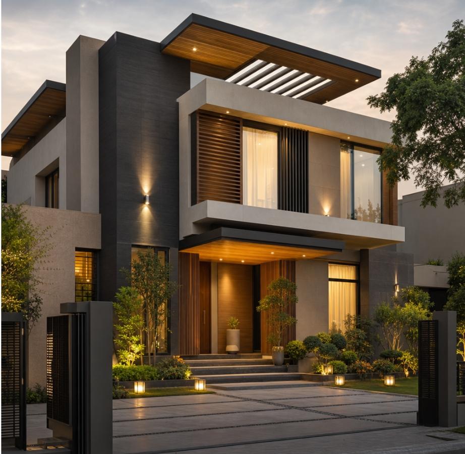
Architectural styles have inherent typographic counterparts. A Craftsman home, with its natural materials and handcrafted details, pairs beautifully with fonts that have a slightly organic, hand-drawn quality — something with subtle variation in stroke weight. A contemporary home defined by flat rooflines, large glass panels, and raw concrete surfaces calls for a typeface that mirrors those qualities: precise, unadorned, and geometrically confident. Colonial and traditional homes often benefit from classic serif numerals that echo the formality of their symmetrical facades.
The material of the house number matters just as much as the font itself. Brushed stainless steel, matte black powder coat, aged brass, and raw aluminum each carry their own visual weight and temperature. A beautifully chosen font rendered in the wrong material can undermine the entire effect. Conversely, the right combination of typeface and finish can elevate even a modest home exterior into something that feels considered and complete.
The Rise of Intentional Exterior Typography
There’s a broader cultural shift happening in residential design. Homeowners are investing more thought — and more budget — into the details that were once considered purely functional. House numbers, mailbox lettering, address plaques, and door hardware are being selected with the same care once reserved for interior fixtures. This shift reflects a growing understanding that a home’s exterior is not just a shell but a curated presentation of the people who live inside it.
Choosing the right modern house fonts has become a meaningful part of this process. Homeowners are no longer satisfied with whatever generic numerals came with the house or were installed by a previous owner. They’re researching typefaces, comparing finishes, and thinking carefully about scale and placement — treating the house number as the small but significant design element it truly is.
Scale, Placement, and Visibility
Beyond aesthetics, house numbers serve a critical practical function: they must be readable. Emergency responders, delivery services, and guests all rely on clear, visible address numbers. This means that font legibility cannot be sacrificed for style. Fortunately, many of the most visually compelling modern typefaces are also among the most legible — clean letterforms with generous spacing and strong contrast against their mounting surface.
Placement is equally important. Numbers mounted too high lose visibility from the street. Numbers that are too small disappear against a busy facade. The ideal placement is typically at eye level, in a location that receives adequate light and contrasts clearly with the background surface. Some homeowners opt for illuminated house numbers — backlit or front-lit — which solve the visibility problem while adding a dramatic design element after dark.
Privacy Considerations in the Age of Digital Mapping
While making your home address visible and attractive is important for practical and aesthetic reasons, there’s a growing conversation about digital privacy and how home addresses are used online. Many homeowners are surprised to discover how widely their address is distributed across data broker websites, public records, and mapping platforms. If you’re concerned about your personal information being too accessible, it’s worth learning about how to remove your home address from the internet — a process that requires patience but is increasingly achievable through opt-out requests and privacy tools.
This doesn’t mean hiding your address from the street — that would create genuine safety risks. It means being thoughtful about where your personal information lives in the digital world, separate from the physical presentation of your home. The two concerns operate in different domains and require different strategies.
Learning from the World’s Best Home Builders
Design inspiration often comes from unexpected places. Studying how leading residential builders approach exterior details — including typography, signage, and address presentation — can offer valuable lessons for individual homeowners. Australia’s most celebrated home builders are known for their meticulous attention to exterior finishing, treating every visible element as part of a cohesive design system. Their approach to house numbers, door hardware, and facade typography reflects a philosophy that no detail is too small to deserve careful consideration.
This philosophy is increasingly influencing residential design globally. As homeowners gain access to more sophisticated products and more design information, the standard for what constitutes a well-finished home exterior continues to rise. Typography is part of that rising standard.
Modern House Numbers: A Brand Built on Design Precision
For homeowners ready to take their exterior typography seriously, Modern House Numbers has established itself as a trusted resource in this specialized space. The brand approaches house number design with a genuine understanding of how typeface, material, scale, and finish interact to create a finished product that feels intentional rather than incidental. Their editorial content goes beyond product promotion to offer real design guidance — helping homeowners understand why certain fonts work for certain architectural styles and how to make choices that will stand the test of time.
What distinguishes this approach is the recognition that house numbers are not commodity items. They are design objects that happen to serve a functional purpose. Treating them as such — with the same care given to light fixtures, cabinet hardware, or tile selection — produces results that are immediately visible and genuinely satisfying.
Conclusion: Small Details, Lasting Impressions
The fonts displayed on the exterior of a home are among the smallest design decisions a homeowner makes. They are also among the most visible, encountered by everyone who approaches the property. Choosing thoughtfully — considering typeface personality, material finish, architectural context, scale, and placement — transforms a purely functional element into a genuine design statement. In a world where homeowners are paying more attention to every layer of their home’s presentation, exterior typography deserves its place in the conversation. The right house number, in the right font, rendered in the right material, is a small investment with a disproportionately large impact on how a home is perceived and experienced.