Chance, Choice, and Chic: How the Aesthetics of Play Shape Modern Lifestyle
In fashion and culture circles, the conversation around “play” has moved far beyond game rooms and into the language of design, wellness, and personal ritual. Play is a palette: color, light, sound, and tactile feedback form a sensorial grammar that can calm or thrill, spark spontaneity or sharpen focus. Just as taste-makers curate closets and coffee tables, they are now curating micro-moments of play, beautiful, intentional interludes that punctuate a well-edited day.
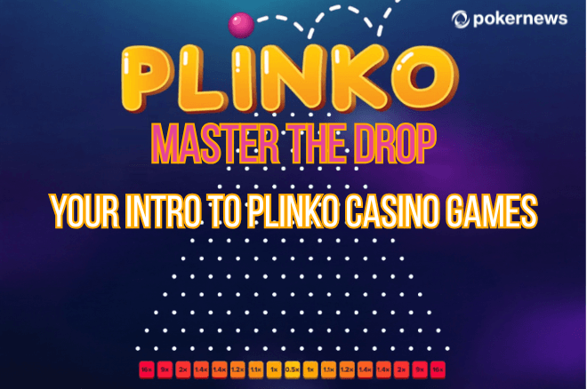
That editorial eye matters. We don’t just want distraction; we crave experiences that feel composed. Luxury hospitality, boutique gyms, and even gallery pop-ups are embracing gameful design, illuminated surfaces, kinetic art, and interactive objects that reward attention with delightful surprise. The point isn’t excess; it’s refinement, the way a single neon line or mirrored edge can turn a room into a stage for possibility. In that spirit, even classic chance-based mechanics are getting a design-forward glow-up, witness the sleek, physics-driven plinko game aesthetic, where gravity, rhythm, and anticipation become a kind of kinetic sculpture mid-scroll.
The New Grammar of Play: Minimalism, Motion, Mood
The most interesting “play objects” today are edited on one high note instead of an orchestra. Consider three pillars:
- Minimal surfaces. Satin-matte plastics or stone-like composites give tactile cues without glare.
- Deliberate motion. Slow, legible physics (rolls, bounces, drops) lull the eye and regulate breath.
- Ambient sound. Soft hits, chimes, and low-frequency pulses create a soundtrack you feel more than hear.
These choices mirror broader lifestyle cues: warm LEDs over harsh white, linen over lacquer, nude palettes punctuated by one electric accent. The effect is less “arcade energy,” more “gallery hush” but with a pulse.
Table: Design Detail → Emotional Effect
| Design Detail | What You See/Feel | Likely Emotional Cue |
| Soft, diffuse lighting | Glow without hotspots | Calm focus, reduced decision fatigue |
| Slow-motion physics | Clear cause-and-effect | Trust, anticipation without anxiety |
| Velvet or matte finishes | Non-slip, fingertip-friendly touch | Groundedness, intentionality |
| Tonal sound palette | Muffled taps, warm chimes | Cozy alertness, fewer spikes |
| Single accent color | One bold hue amid neutrals | A sense of ritual and occasion |
Micro-Moments, Macro-Impact
We talk a lot about morning routines and night rituals, but the in-between minutes often decide how a day feels. Five minutes between meetings can become a doom-scroll, or it can be a mindful reset. Gameful micro-moments tiny, finite loops with a clear beginning and end work because they compress novelty into a safe container. The secret isn’t just distraction; it’s closure. A loop completes, you exhale, and you reenter the day with your attention cleaned and pressed.
Designers of wellness apps, boutique hotels, and concept stores understand this cadence: they offer a brief arc (setup → reveal → finish) that refreshes, not hijacks. The same arc sits behind good espresso, a perfectly sequenced playlist, or a minimalist kinetic toy on a desk. Play is simply another ritual in the arsenal of self-styling.
The City Room: Bringing Gameful Design Home
You don’t need a games room to curate a “city room” corner dedicated to exquisite play. Think of it like styling a bar cart functional, beautiful, and very you.
A five-piece setup to consider:
- Low-glare light. A petite lamp with a warm cone (2700–3000K) keeps focus soft.
- Touch-positive surface. Stone, leather desk mat, or velvet tray to invite tactile contact.
- One kinetic object. A tasteful balancing mobile or weighty steel spinner.
- Ambient audio. A tiny speaker set to gentle chimes or vinyl crackle, volume barely-there.
- A restraint cue. Sand timer or mini routine card ritual ends when the sand does.
The point is to make the “play corner” a place of intentional pause not an attention sink, but an attention rinse.
Style Meets Systems: The Psychology of Elegant Chance
Why do minimalist, physics-driven games feel so soothing? Three reasons:
- When outcomes unfold in visible, causal steps, the brain relaxes.
- Temporal framing. Short loops reduce temporal discounting and compulsive “one more” cycles.
- Aesthetic containment. Neutral palettes + single accent color signal that the experience is deliberate, not chaotic.
This is also why elegant interfaces (the ones with air, not clutter) feel “expensive” even when they’re not: they respect your cognitive budget.
The New Etiquette of Play (For Hosts and Guests)
In social spaces, play doubles as an icebreaker and mise-en-scène. You can stage it the way you would a tasting flight or perfume bar.
- Rotate objects, not volume. Keep one “hero” piece in focus, swap it monthly.
- Invite, don’t instruct. A quiet placard or subtle placement says “touch me” better than a sign.
- Close the loop. Use time-boxed rounds so conversation remains the main event.
- Mind the soundstage. Percussive clacks read “busy”; soft chuffs read “luxe.”
Responsible Indulgence: Guardrails as Design
Good taste includes good boundaries. In lifestyle terms, that means the guardrails are as designed as the fun:
- Time-boxing baked in. Use timers and rituals; end deliberately.
- Single-screen serenity. Avoid multi-screen chaos; the aesthetic is focus.
- No-fuss exits. A graceful “end state” keeps the aftertaste clean.
When the container is well designed, indulgence feels like care not chaos.
Curating a Moodboard: From Fashion to Play
If you build outfits around silhouette and texture, build play around motion and touch. A quick moodboard logic:
- Silhouette → Motion: Fluid drape = slow arcs; sharp tailoring = crisp bounces.
- Texture → Tactility: Bouclé and suede invite slower, lingering touch; steel and lacquer signal precision.
- Accent → Reveal: A single citron stripe or ultramarine token punctuates neutrals like a cuff or clutch.
The crossover with fashion isn’t a stretch; both are about tension and release, surprise and control.
A Minimalist Buyer’s Guide (Without the Clutter)
What to look for:
- One hero mechanic. Multipurpose toys look busy; pick a single satisfying action.
- Weight and balance. Heavier objects read luxe and feel grounded.
- Finish quality. True matte or velvet-touch beats glossy fingerprints.
- Gentle audio. If it clicks, it better whisper.
What to avoid:
- Bright, blinking chaos that looks like a stock ticker.
- Over-gamified dashboards that feel like an obligation, not a pleasure.
- Loud sound profiles (they age fast and dominate a room).
The Editor’s Litmus Test
Ask: Would I leave this out on the coffee table when the room is otherwise perfect? If the answer is yes, you’ve found a play that understands style.
Closing Note: Play as Personal Luxury
The highest form of luxury is time used well. Gameful design, pared back, beautiful,and intentional can convert scraps of a day into restorative moments. Think of it as the silk lining inside a jacket: you don’t always see it, but you feel it. And that, more than spectacle, is what modern luxury is about: experiences that disappear into your life while making everything else look and feel a little sharper.